Making the Prospectus(Designing Logo)
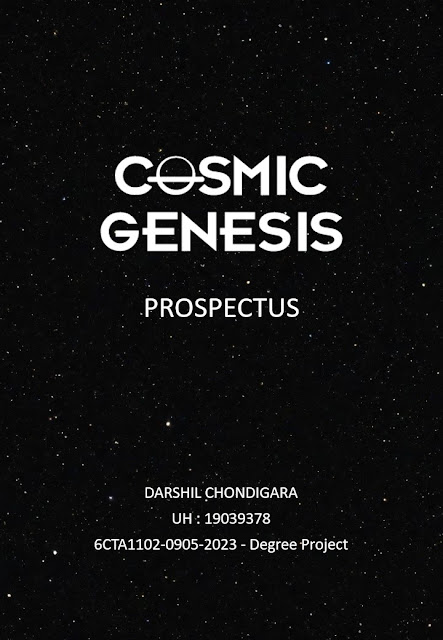
Creating a logo is an exciting process that involves many creative detours and turns until you arrive at a brand identity that perfectly captures your vision. I'll discuss my approach of designing the typography logo for "Cosmic Genesis" in this blog post. For this project, I chose to use a dramatic black and white colour palette and substitute a minimalist picture of a black hole for the letter "O." Come along as we explore the world of symbolism and design.
The Origin of a concept: I got the concept for the Cosmic Genesis logo while staring up at the night sky, as is the case with all great designs. I was fascinated by the idea of a black hole—a celestial body with extremely strong gravity. It represents the start of something fresh and the countless opportunities that it holds.
The Symbolic "O": I sought a symbol to take the place of the "O" in "Cosmic" that would convey the idea of a black hole without overpowering the typography. I drew a few different ideas before deciding on a simple drawing of a black hole: a dark circle with a faint gravitational lensing effect surrounding it. This represents the immense unknown and the potent force of creativity.

Inspired by "Singularity" I designed a minimal black hole which i can then use in my Typography logo.

The Typography: Choosing the appropriate typeface for the logo was essential. To be exact, I chose Futurama Bold as my modern sans-serif typeface to guarantee readability and harmony with the black hole symbol. When working with cosmic themes, precision and refinement are crucial, and this is reflected in the typeface.
The Colour Scheme: I took a risk by using a black and white colour scheme for Cosmic Genesis. The colour black is a symbol for the unknown, the mysteries of the cosmos, and the gravitational pull of the black hole. Conversely, white represents innocence, enlightenment, and the possibility of fresh starts. The interaction between darkness and light, or cosmic genesis, is embodied in this duality.
Iteration and Refinement: The process of design is iterative. I made multiple iterations of the design, adjusting the typography and playing around with the black hole symbol's size and placement. With every iteration, the logo became closer to my idea of a modern and eye-catching depiction of Cosmic Genesis.
Adaptability and Versatility: A strong logo should be able to work in a variety of settings. It was my goal to ensure that the Cosmic Genesis logo would remain effective even when utilised in a variety of sizes and settings. The logo is always eye-catching and instantly identifiable, whether it's on a business card, website, or promotional items.
Final Remarks:
It has been a fulfilling experience to design a typographic logo for Cosmic Genesis that combines the elegance of simplicity with the mystery of space. The cosmic forces at work in the universe and the countless opportunities for fresh starts are symbolised by the black hole symbol and the black and white colour scheme. It's a logo that perfectly encapsulates Cosmic Genesis' core idea—the amazing beginning.
In summary, designing a logo involves more than just aesthetics; it also involves telling a narrative and capturing the spirit of a project or company. The Cosmic Genesis logo is proof of the ability of design to profoundly and simply communicate difficult thoughts and concepts.


Comments
Post a Comment