Posts

Poster Designing in Adobe Indesign

Image
  Adobe InDesign  is Desktop Publishing  and page layout designing software application   .  It can be used to create works such as posters, brochures, magazines, newspapers, presentations, books and ebooks. InDesign can also publish content suitable for tablet devices in conjunction with Adobe Digital Publishing Suite.  It also supports export to EPUB    format to create e-books and digital publications, including digital magazines, and content suitable for Tabs and Ipads .  The task was to design a minimal poster in indesign. For the  referencing The website Swissted (https://www.swissted.com ) was Allocated . Which is website for selling recreated vinyl poster on old and new bands. After going through website and deciding bands on which i wish to make posters. I started. The UI of Indesign was easy. as we were working in essential mode.                             ...
Setting up the wordpress account with filezilla

Image
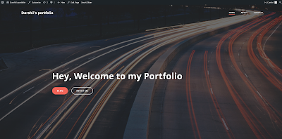
Setting up the wordpress site for sharing portfolio was very easy for me because I am kind of in technical stuff and it is important to learn. Just by learning system it wont be enough we should know how should we make systems to work for ourselves.  Wordpress is free and open source content management system(CMS) paired with MySQl and MariaDB Database.It supports plugin architecture and template systems known as themes in wordpress. I  used one theme and slider plugin to create my website. Which looks like  (https://ca-net.herts.ac.uk/~dc21aaz/wordpress/) The interface of wordpress is intuitive and beneficial for beginners honestly i had a  great time going through interface and understanding each aspect of it . It was very Easy compared to my contemplation  In interface everything that is given is particularly useful . everytime you install a plug in and activate it there is a new button directly leading to that. All the pages that you create is in the pages b...

Photomontage inspired by Peter kennard

Image
 Peter kennard is london based photomontage artist and professor of   political art. Peter was strongly intending to   show his involvement in   Anti-vietnam war moment he turned from paintings to photomontage   artist .Popularly   known for his addition of cruise missiles in painting   of john stable called The Hay Wain. (below is the Art work)                   (https://www.tate.org.uk/art/artworks/kennard-haywain-with-cruise-missiles-t12484)                   The Hay wain With Cruise Missiles The hay wain painting by john constable was depicting relax life of people who live in countryside. kennard smartly placed missiles to change meaning to there's to peace if there would be such weapons this showed his intention in favor of  campaign of nuclear disarmament. I made an Artwork inspired by him in adobe photoshop as he seemed t...

A Photomerge Inspired by Hannah Hoch

Image
 Hannah Hoch was a German Dada Artist . One of the originators of Photomerge or Photocollage in which various photos are pasted one another in a way that Conveys a message . She was a strong feminist And recognisable among men for her professionalism and energy . She was a Strong political Critic who structured social roles. Her art works encouraged leberation and agency of women during Weimar republic.  (Example of her art work ) I did not tried to replicate any of her art work but Surely tried to made Two variations which were inspired by hers. As she made photo collages with mainly one similarity of mixing one animal with human. I saw her trend in most of her art work And i tried my hands on. I had an amazing time doing it in Adobe Photoshop . Keeping it clean and detailed as possible as possible. I did replicate the color schemes she uses giving it a vintage kind of  look and feel. I used tools like clone tool, content aware fill , Transform and mesh tools Then camera...

Example of One of the Best Portfolio sites

Image
  This Portfolio website is of Sophie Brittian who is a Visual Designer Specializing in UI/UX designing. Website is minimal as possible with negative space which is important as per my contemplation because it gives feel of talent and not the feel of extraordinary janky designers. She has uploaded only 6 of her best works in minimal way with just background and simple mock ups but the interesting this is there is a button which takes you to the full Details of each projects with color variations and other mock ups, Little paragraphed information explaining the exact idea with like to that particular site. Which I think is best way to showcase any work (below is Screenshot)(https://www.sophiebritt.com/) I think the overall mood and tone of the website is Light Themed with the perfect use of space and colors. the only buttons are colored in various colors featuring the intuitive design. There is only three buttons to get to whole website.  About the designer is always A chance t...

The Website with Good Design and Structure

Image
  The squarespace website is the website used for designing websites. On this platform people can Design their Shopping, Portfolio and other business related websites. It also includes Domain name which makes it a better option then such similar sites . I just saw the advertisement of squarespace in a Youtube video and checked it out . It is indeed eye catching website with impressive layout and intuitive design .  The user interface and user experience is top notch . You can just scroll down the first web page and get whole idea of what this can provide you and why this is a better option . The main attractions are the way in which templates are illustrated maintaining the aspect of negative space . It manages to include various tools and which ones are used most according to their analytics . We can visit pages in which visitors are engaging the most .         My most favourite thing about this was obviously the motion graphics used whenever yo...

Add A shadow (photoshop session 2)

Image
As part of second session we had to cut this man from whole another image and bring it in this photo and make this man cast a shadow to be honest it was a simple trick using free transform and opacity but we also learned perspective view we have to adjust the size of man compare to this photo angle to look more realistic and little bit about saturation